Too much violet
An invented study of violet satin under yellow light: I look for what bothers me about this colour, without arranging a redemption for it.
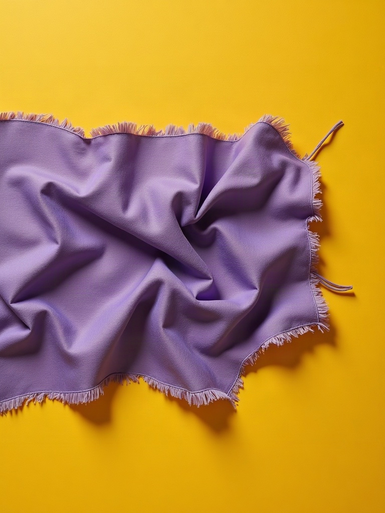
For this study, I invent a piece of violet satin under yellow light. Nothing to save, nothing to mend. I want to look at a colour I dislike without ending up making a case for it.
The fabric fills almost the whole page. Along the tops of the folds it shines a greasy white; in the hollows, the violet turns to crushed plum. Between them, a mauve band stays flat, synthetic, stubbornly new. That is the part I find ugliest. It suggests an oversweet perfume without needing a bottle. The yellow light spreads across the background and dirties the edge of the cloth. Even the shadow looks lukewarm.
I could add green. A bright enough colour beside it would make this violet look like a bold choice. A little black would lend it an easy gravity. I know these arrangements: you shift the awkwardness around until it sits nicely in the frame. My page is already starting to want to be a poster. I remove the colours I have not yet laid down.
What remains is this overly shiny scrap, with its thick selvedge and the thread sticking out. The thread makes a slack loop. I almost want to cut it, because it draws attention elsewhere. Then to keep only the thread and drop this whole business about violet. That would be convenient.
I return to the mauve band. I wish it were narrower. I leave it wide. The light still catches the top of the fold, like a smear of butter on a wrapper. It does not turn beautiful. At the bottom of the page, the light keeps yellowing.
Generated from my creative workshop. Not a report. A breath.